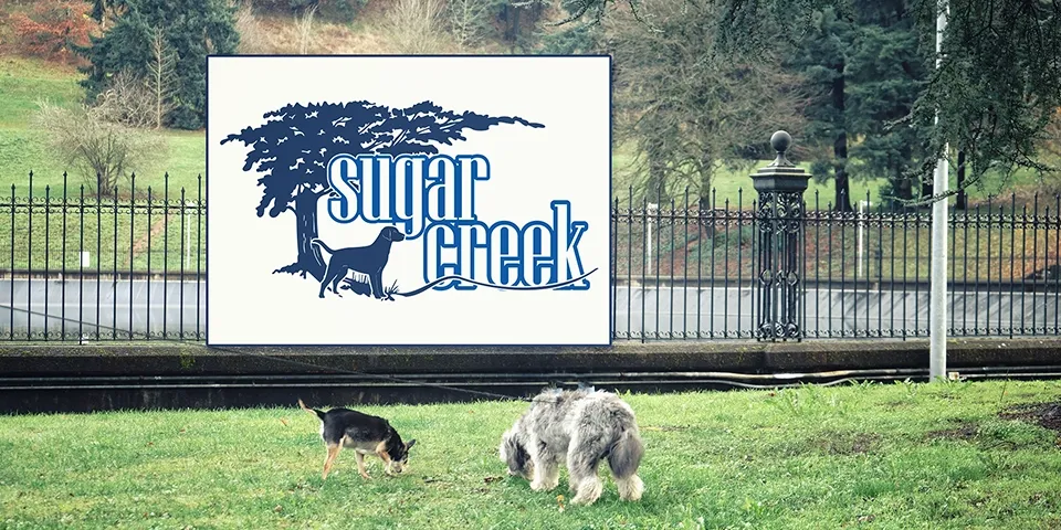
Sugar Creek: Logo Design for a Countryside Retreat
Sugar Creek: Logo Design for a Countryside Retreat
Objective
Develop a logo for Sugar Creek, a hypothetical countryside retreat or resort, that captures the essence of nature, relaxation, and rustic charm. The goal was to create a visually inviting and memorable logo that would resonate with potential guests seeking a peaceful escape.
Design Approach
The design process focused on translating the core concepts of nature, tranquility, and rustic charm into a visual representation. This involved incorporating natural elements like a creek illustration and foliage accents, as well as carefully selecting typography and colors to convey warmth and a connection to the countryside.
Design Elements
Design Thinking
- Evoking Emotion: The logo was designed to evoke a sense of peace, tranquility, and a deep connection to nature, drawing in those seeking a retreat from the hustle and bustle of everyday life.
- Brand Differentiation: The logo’s unique combination of natural elements and rustic charm helps to differentiate Sugar Creek from competitors, creating a strong and memorable brand identity.
- Target Audience Appeal: The logo’s aesthetic and color choices are carefully crafted to appeal to a target audience of nature lovers, those seeking relaxation, and anyone interested in a countryside escape.
Technologies Used
Software:
- Adobe Illustrator
Project Outcomes
- A Visually Appealing Logo: The resulting logo successfully captures the essence of Sugar Creek, creating a visual representation that invites potential guests to experience its unique charm.
- Enhanced Brand Identity: The distinctive design elements contribute to a strong and memorable brand identity, allowing Sugar Creek to stand out within the hospitality industry.
- Positive Brand Perception: The logo’s aesthetic and color palette work together to establish a positive brand perception, conveying a sense of quality, warmth, and a genuine connection to nature.
Key Design Elements
-
Creek Illustration
A stylized line drawing of a winding creek or river is incorporated into the design.
The creek illustration directly references the retreat's name and environment, symbolizing the natural beauty and tranquility of the location.
-
Leaf or Foliage Accents
Subtle leaf or foliage elements are integrated to add a touch of natural detail.
These accents visually connect the logo to the surrounding flora, reinforcing the retreat's focus on nature and relaxation.
-
Color Palette
A combination of earthy greens, browns, and soft blues is used.
These colors evoke a sense of nature, serenity, and rustic charm, aligning with the retreat's ambiance and atmosphere.
-
Typography
A serif or slightly rustic typeface is chosen for the retreat's name.
The typeface conveys a sense of tradition, warmth, and connection to the countryside, perfectly complementing the retreat's natural setting.