Boomerang Cab Co. Branding
Project Overview
Boomerang Cab Co. is a new taxi service aiming to provide reliable and community-focused transportation. They needed a complete brand identity that would communicate their friendly and trustworthy approach, helping them to stand out in the competitive ride-sharing market.
Design Objectives
- Create a Friendly and Approachable Brand: The identity needed to feel welcoming and reliable to build trust with a local customer base.
- Develop a Memorable and Unique Logo: The logo had to be distinctive and easily recognizable on vehicles, in an app store, and on marketing materials.
- Ensure Versatility Across Applications: The branding had to be flexible enough to work effectively on everything from the side of a car to a small app icon.
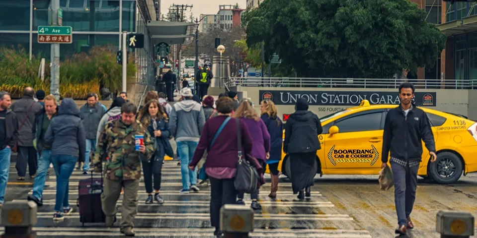
The Final Brand Identity
The new brand identity has been successfully rolled out across the Boomerang Cab Co. fleet and digital platforms. The friendly and memorable branding has helped the company to quickly establish a positive reputation in the community.
Key Design Elements
-
Playful Boomerang Logo
The logo features a stylized boomerang, cleverly integrated with a subtle map pin icon to represent movement and location.
This creates a memorable and relevant mark that is both friendly and indicative of the company's service.
-
Warm and Trustworthy Color Palette
A color scheme of bright yellow and deep blue was chosen to evoke feelings of reliability, safety, and optimism.
The yellow is eye-catching and energetic, while the blue provides a sense of calm and trustworthiness.
-
Clear and Legible Typography
A clean, rounded sans-serif typeface was selected for the company name and all marketing materials to ensure maximum readability.
This contributes to the brand's approachable and user-friendly personality, which is crucial for a service-oriented business.
-
Scalable Vehicle and App Graphics
The branding was designed to be easily adaptable for vehicle wraps, app icons, and other digital and print applications.
This ensures a consistent brand experience across all customer touchpoints, from seeing a cab on the street to using the mobile app.